|
|
|
|
|
|
|
|
|
|
- Overview
- Options of the description window
- "General" tab
- "UI" tab
- "Details" tab
- "Style" tab
Image control in a window
This help page presents the characteristics of an Image control found in a window. Reminder: To create an Image field: - On the "Creation" tab, in the "Usual controls" group, click "Image".
- Click at the desired location to create the control. The control appears in the editor.
To view the control characteristics, select "Description" in the context menu of the control. Options of the description window "General" tab The "General" tab is used to define the displayed image and its characteristics. Choosing the image displayed in the control: The image displayed by the control is selected via the  button, "Browse" option. Other options: It is possible to define: "UI" tab On the "UI" tab, you can define: - the initial state of the control,
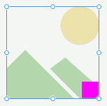
- whether or not a representation symbol is displayed in the control. This symbol is a thumbnail displayed by default to represent the Image control in the editor.
 Image with representation symbol  Image without representation symbol - the action performed during a right click,
- the context menu associated with the control,
- ...
"Style" tab The "Style" tab is used to define the style of different elements found in the Image control. You can define: - An animation when changing the image displayed in the control ("Control animation" element). The "Parameters" button is used to define the duration of animation.
- A border ("Outside border" element).
- A blurred shadow ("blurred shadow" element).
To define the image frame: - Select the "Outside border" element.
- Expand the "Border" list. The available borders are displayed.
- The "Round xxx" options are used to define a round border. If these options are selected, a blue arrow allows you to open the window for style configuration in the "Style" tab.
- The "Image (9-slice scaling)" option allows you to choose an image for the border and to configure it via 9-slice scaling.
- The "Custom" option is used to define a custom border. If this option is selected, a blue arrow allows you to open the custom shape settings.
- The "Round" option is used to create a round image. If these options are selected, a blue arrow allows you to open the configuration window (line thickness and style)
Caution: To avoid distortion, the image must be displayed in a homothetic mode.
Note: The  icon (to the right of the "Frame" option) lets you configure the shadow of the field's frame.. If a shadow is used, you can choose: icon (to the right of the "Frame" option) lets you configure the shadow of the field's frame.. If a shadow is used, you can choose: - the X and Y offset of the shadow,
- the percentage of opacity,
- the blur radius,
- the color of the shadow.
This page is also available for…
|
|
|
|
|
|
|
|
|
|
|
|
|
|
|
|
|
|
|
|