|
|
|
|
|
|
|
|
- Overview of the Navigation Bar control
- Control in a static or dynamic page
- Creating a Navigation Bar control
- Characteristics of Navigation Bar control with Burger created by default
- Characteristics of Navigation Bar control
- Choosing the display mode
- Width of side panes
- Available style options
- Operations in the editor
- Handling the control in the editor
- Customizing slices
- Displaying the expanded area at runtime
- Using a preset action
- Using the Collapsed property programmatically
The Navigation Bar control
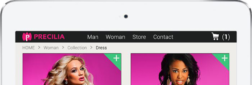
Overview of the Navigation Bar control Control in a static or dynamic page The Navigation Bar control is used to create a menu area that can easily adapt to the browser size. This area can contain all types of controls. Two display modes are available: - Extended mode: The navigation bar includes 3 sections: Left, Middle, Right. The 3 sections are displayed.
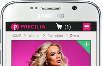
 A navigation bar in extended mode - Compact mode: The navigation bar includes the Left and Right sections as well as a Middle section that can be expanded (when clicking a button for example).
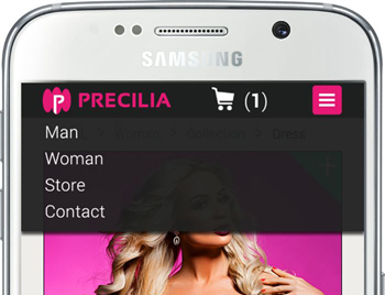
 A navigation bar in compact mode  A navigation bar in compact mode with the middle section expanded
Remark: This control is available for the pages in "Responsive Web Design" mode only. Creating a Navigation Bar control To create a Navigation Bar control: - Create or open a page in "Responsive Web Design" mode.
- On the "Creation"pane, in the "Navigation" group, expand "Nav. Bar" and select the type of navigation bar to create:
- Blank navigation bar: This navigation bar contains no control. It can be entirely customized. It can be used to manage a specific layout for example.
- Navigation bar with 'Burger' menu: This navigation bar is filled beforehand to manage the display of menus in the different platforms. Some parameters are specified by default, like the change of display for the first slice.
- Click where you want to create the control in the page. The control appears in the editor.
Characteristics of Navigation Bar control with Burger created by default The Navigation Bar control is automatically adapted to the Responsive Web Design mode: - In the largest slice:
In this slice:
- the control is displayed in "Extended" mode,
- the "Burger" button used to expand the middle area of navigation bar is hidden.
- a drop-down menu is displayed. This menu can be deleted or customized according to your requirements.
- In the smaller slices:
In these slices:
- the Navigation Bar control is overridden to be displayed in "Compact" mode.
- the "Burger" button used to expand the middle area of the navigation bar is displayed. The action defined for this control is "Collapse/Expand the navigation bar". This action is used to display the middle section in popup format.
To view the characteristics of the control, select "Description" in the context menu. Characteristics of Navigation Bar control Choosing the display mode To configure the display mode of Navigation Bar control: - Display the description window of the Navigation Bar control.
- In the "UI" tab, configure the display mode of control:
- Validate.
Remark: The display mode can be overridden for each slice. By default: - When a Navigation Bar control with a burger is created, all smaller slices are overridden.
- When a blank Navigation Bar control is created, the smaller slices are not overridden.
Width of side panes The size of side panes is used to define the behavior of the two outside sections in the Navigation Bar control. You can use one of the following options: - No min width: If this option is chosen, the 3 panes always keep a proportional size.
- Min edit width: If this option is enabled, the slice size defines the threshold from which the side panes are no longer reduced. From this level, only the middle pane is reduced.
- Fixed width per slice/layout: If this option is chosen, the width of left and right panes does not change in the Navigation Bar control. Only the middle pane is enlarged or reduced.
Reminder: The size of the panes can be defined for each slice. In this case, the option chosen for the width of panes is applied to the new size of panes. Tip: By hiding a side pane and by selecting "Fixed width per slice", the Navigation Bar control can be used to create a layout that includes a fixed section (for an ad banner for example) and a fluid section. When creating the Navigation Bar control (blank or with Burger), the selected option is "Min edit width" by default. Available style options In the "Style" tab of the description window of Navigation Bar control, you have the ability to configure: - The CSS style of navigation bar,
- The CSS style of expanded pane.
- The effects used for the expand operation: expand with overlap, expand with push, ...
Handling the control in the editor The Navigation Bar control is a container control whose aspect depends on the display mode used. In the editor, the Navigation Bar control is divided into 3 panes: left (1), middle (2) and right (3). The size and the display of panes depend on the display mode of Navigation Bar control. - In "Extended" mode: The 3 panes are displayed in the editor. The controls can be positioned in the different panes (logo, menu, links, ...).
- In "Compact" mode: The middle pane (2) is not displayed anymore (it is hatched in the editor). The controls are found in the expanded area.
To view and edit this expanded area in the editor, all you have to do is click the hatched area (you also have the ability to select "Edit the collapsed pane" in the context menu of the control).
The expanded area appears in edit (enclosed in a yellow border). You can perform the requested modifications. To exit from the edit mode, press the Esc key.
Remarks: - Any type of control can be used in the panes.
- The panes cannot be handled through programming.
Customizing slices The following elements in the Navigation Bar control can be customized for each slice: - the position of controls in the panes.
- the position of controls in the middle pane (collapsed or expanded mode).
- the display mode of control (extended or compact).
- the size of panes.
You can also hide a pane in a slice. Displaying the expanded area at runtime Two methods can be used to display the middle area of the modification bar at run time: Using a preset action The preset action "Collapse/Expand the navigation bar" is used to display the middle area of the navigation bar in a popup. This action is available in the Button and Link controls for example. To use this action: - Display the description window of the Button or Link control.
- In the "General" tab, in the "Button action" area, expand "Type" and click on "More choices" . Select "Do an action on another control".
- In the "Control" area, select "Collapse/Expand navigation Bar".
- Validate the control description window.
Remarks: - The control associated with the preset action "Collapse/Expand the navigation bar" is not necessarily found in the navigation bar.
- By default, the Navigation Bar control with Burger uses a "Hamburger" button to expand the navigation bar.
Using the Collapsed property programmatically When the Collapsed property is used in browser code on the Navigation Bar control, it collapses or expands the middle area of the navigation bar. You can use Collapsed in the hover code of a control for example. |
|
|
|
|
|
|
|
|
|
|
|
|
|
|
|
|
|
|
|