|
|
|
|
|
|
|
|
|
|
- Overview
- Selection mode ("UI" tab of the description window)
- Selection modes
- Display mode ("Details" tab of the description window)
- The different available modes
- Vertical standard mode or column gallery mode: Anchoring columns
- Resizing the cells of a Looper control
- Other settings in the "Details" tab
- Input settings
- Scrollbar
- Movements and gestures
- Search control
- When a Looper control is populated programmatically
- Different content in each row ("Content" tab)
- Implementation
- Characteristics of internal windows
Characteristics of Looper controls in a window
To view the characteristics of the control, select "Description" in the context menu. In a window, the attributes not being proposed by default, only the characteristics of the Looper control will be displayed. The main control characteristics are grouped in the following tabs: - The "General" tab displays the list of controls found in the Looper control.
- On the "UI" tab, you can select:
- On the "Details" tab, you can select:
- On the "Content" tab, you can define:
- The "Style" tab allows you to define the style of the different control elements.
Selection mode ("UI" tab of the description window) Selection modes The following selection modes are proposed in a Looper control: - No selection: The selection banner is not displayed on the selected row.. However, the "Select a row" event in run when the row is selected.
- Single selection: The selection banner is displayed on the selected row.. The code in the "Select a row" event is run.
- Multi-selection: The selection banner is displayed on the selected rows.. To select several rows, hold the Shift or Ctrl key down. The "Select a row" event is run whenever a row is selected.
 Multiple selection via a single click: This option allows you to multi-select with the mouse.. If this option is selected, all you have to do is click a row in order for this row to be added to the multi-selection or removed from the multi-selection. Multiple selection via a single click: This option allows you to multi-select with the mouse.. If this option is selected, all you have to do is click a row in order for this row to be added to the multi-selection or removed from the multi-selection.   Android/iOS selection mode: This option hides the selection banner after selection.. The banner appears only when the line is pressed.. Then, the row selection code is executed. Android/iOS selection mode: This option hides the selection banner after selection.. The banner appears only when the line is pressed.. Then, the row selection code is executed.
Display mode ("Details" tab of the description window) The different available modes Several display modes are available: - Standard (grid): Display mode corresponding to the standard RepeatString field.. In this case, the Looper control can be horizontal or vertical.
- Online Gallery: Display mode corresponding to the Online Gallery field. For more details, see 'Image gallery' Looper control.
- Column Gallery: Display mode corresponding to the Column Gallery field. For more details, see 'Image gallery' Looper control.
These modes can be selected in the "Details" tab of the Looper control description window. Vertical standard mode or column gallery mode: Anchoring columns The available options are as follows: - Variable column width: If the width of the RepeatString area allows the display of an additional column, the number of columns remains unchanged.. Only the width of columns is modified.
- Variable width and number of columns: If the width of the RepeatString area allows the display of an additional column, then it is added.. Before adding the column, the rows are stretched horizontally.
- Variable number of columns (left): If the width of the RepeatString area allows the display of an additional column, then it is added.. Before adding the column, the columns are aligned on the left and an empty area may appear on the right.
- Variable number of columns (centered): If the width of the RepeatString area allows the display of an additional column, then it is added.. Before adding a column, the columns are centered in the control and an empty area may appear on either side of the centered columns.
- Fixed width and number of columns (left): Number of columns and column width remain unchanged. Columns are aligned to the left.
- Fixed width and number of columns (centered): Number of columns and column width remain unchanged. The columns are centered.
Other settings in the "Details" tab Movements and gestures The following options are available: - Per-pixel scrolling: a row may not be entirely displayed according to the scrollbar position.
- Touch scrolling: used to handle the scrollbar in a touch screen.
Different content in each row ("Content" tab) The RepeatString Looper control fields let you fully customize the appearance of repeats: layout, content, etc.. This makes it possible to place Looper controls within other Looper controls. Note: This feature is not available on horizontal Looper controls.. Implementation To create a Looper control with variable content: - Create a Looper control populated programmatically. This control must be a vertical Looper control containing a single column.
- Open the Looper control description window.
- In the "Content" tab of control description:
- Check "Use an internal window per row (LooperAddIW function)".
- Indicate the mode for unloading the internal windows:
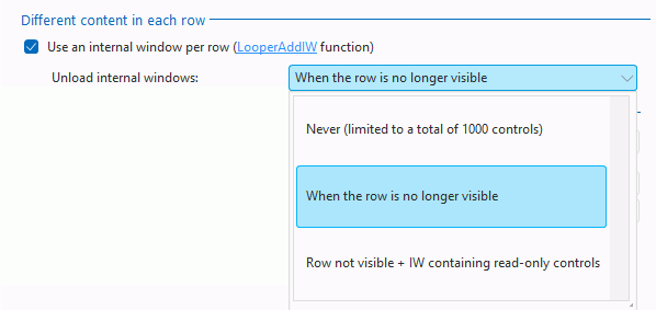 - Never: Internal windows are loaded when the associated row is visible in the field. The unload is never performed when using the control. It is performed when closing the window. This mode is recommended if there are few internal windows and if they do not contain many controls .
Advantage: All data always available
Disadvantage: High memory consumption. - When the line is no longer visible (default setting): Internal windows are loaded when the associated row is visible in the. The unload is performed when the row is not visible anymore. This mode is recommended for the non-editable Looper controls. Indeed, if an internal window allows the input, the content typed by the user is lost when this internal window is no longer visible.
Advantage: Low memory consumption.
Disadvantage: Loss of information entered by the user. - Line not visible + FI containing only display fields: Internal windows are loaded when the associated row is visible in the field. The unload is performed according to the type of row:
- If the row contains no control allowing the user input, the associated internal window is unloaded when it is no longer visible.
- If the row allows the input, the associated internal window is never unloaded.
- Validate the control description window.
- Create the different internal windows corresponding to the rows of the Looper control.
- Add the internal windows to the Looper control using the following functions:
| | | LooperAddIW | Adds a row as an internal window at the end of a Looper control populated programmatically. | | LooperInsertIW | Inserts a row as an internal window into a Looper control populated programmatically. | | LooperModifyIW | Modifies a row corresponding to an internal window in a Looper control populated programmatically. |
Characteristics of internal windows The characteristics regarding the width and height of internal windows are as follows: - Height: The height of the row using an internal window corresponds exactly to the height of the internal window defined in editing.. The height of internal window cannot exceed the height of Looper control.
- Width:
- If the width of the internal window is less than the width of the Looper control, the internal window is automatically increased and anchors are applied.
- If the width of the internal window exceeds the width of the Looper control, the internal window is automatically truncated.
In most cases, we advise you to create the internal window with the smallest possible width and to use anchors.
Note: If the internal window has fields adapted to the content, the height of the row will be increased or decreased according to the content..
Related Examples:

|
Unit examples (WINDEV): The Looper control
[ + ] Using the Looper control. You have the ability to add a row with LooperAddLine. The following syntax is used to retrieve the existing values: AttributeName[Subscript]
|

|
Cross-platform examples (WINDEV Mobile): WM Managing Contacts
[ + ] This example presents the management of contacts for Android et iOS. It is used o: - list the contacts found on the phone - call the contacts - send SMSs to the contacts - ...
|

|
Cross-platform examples (WINDEV Mobile): WM Attendance
[ + ] This application is an attendance manager. It allows you to list the persons who attended a meeting. The database is filled beforehand with the list of registered persons. You have the ability to find a person by using his/her name. The following topics are presented in this example: 1/ using a browsing looper based on a query 2/ using a database in HFSQL format.
|
This page is also available for…
|
|
|
|
|
|
|
|
|
|
|
|
|
|
|
|
|
|
|
|